
by Don Pingaro | Sep 21, 2019 | Commerce Strategy, System Integrations
Congratulations! You survived the Back to School retail surge. While the true test of eCommerce performance is yet to come, any hurdles you encountered during Back to School should be taken care of well before then. Consider these your warning shots. To help, here are 3 precautionary measures you can take to digitally strengthen your store for the holidays.
1. Stress Test to Avoid Lost Revenue
A wave of more than 6.2 billion shoppers will descend on digital retailers during Cyber Week. Unfortunately, not all businesses are prepared for success…
For example, J. Crew’s site crashed on Black Friday in 2018 and issues persisted throughout the afternoon. Analysts predict the outage cost the company around $780,000 in just five hours. Shoppers flocked to Twitter to complain en masse, causing a firestorm of anger to erupt across the web. This is where the real damage was done. Like a ghost story from holidays past, this is a warning for retailers everywhere to change for the better.

Redstage’s CEO Adam Morris identified the top “holiday rush” issues we’ve helped clients through in years past. Here’s what to watch out for:
1. Slow Site Speed
2. Price Caching
3. Broken or Buggy Checkout
4. Server Overload or Timeout
5. Add to Cart Features Failing
“The holidays are a time of increased profits, but that comes with a huge load on websites,” Morris says, “So if you haven’t done proper stress testing to account for higher demand, you won’t know how your online store is going to react.”Adam Morris, CEO at Redstage
Preparing for the worst now can save you money and your reputation later with one simple step— testing. Skipping this step could spell disaster that leaves the specter of poor service hanging over your reputation for years to come.

2. Your Back-End Checklist at Present
From Thanksgiving to Black Friday through the end of Cyber Week, retailers have a few critical days to rake in as many sales as possible. During this shopping frenzy customers both in-store and online. Regardless of how they buy, your online store (or your app) will more than likely be their first stop. We developed a checklist of what you can do today to ensure your eCommerce site survives Cyber Week.
- Optimize your site’s user experience with A/B testing.
- Check your indexing to avoid price caching.
- Review all error codes to avoid a broken checkout.
- Avoid overload and crashes by scaling your server.
- Double-check key functions to avoid important features failing.
- Complete load testing to prepare for an increase in traffic.
- Utilize an automated monitoring system for real-time updates on 404s and checkout errors.
- Upgrade your payments and security platforms to prevent payment fraud.
- Lastly, be prepared to scale up your support team on the fly. If something goes wrong, even for a few minutes, you’ll need a sizable support team to manage angry customers and correct the issues.
“If you’re not using visitor data to identify the friction points in your checkout, you risk focusing your budget in the wrong places. A data-driven approach to optimization means trusting your analytics even when the message is counter-intuitive.”Oliver Sosinsky, Sr. Solutions Engineer at Redstage
Learn a valuable lesson from LuLu Lemon. Last year, the athleisure brand’s site went down the morning of Thanksgiving Day. Shopper outrage hit Twitter at 8am EST with a “Site is down. Ugh!”
In the first minutes of the shopping event of the year, the brand was stuck, entangled in crisis. Once the site got back online, more errors appeared, causing sales prices for in-cart items reset to regular prices or prevent customers from checking out.
With proper bug monitoring and back-end preparations, this fiasco could have been avoided. Take a page out of our book and start monitoring now. You’ve done the legwork to bring customers to your site, now protect it.

3. Capitalize on the Future
A single visitor doesn’t guarantee a transaction and a single transaction doesn’t guarantee a loyal customer. Flawless mobile experiences will do both, but takes some serious testing.
Conversion rate optimization turns your visitors into customers while ensuring they receive an immaculate customer experience. While no two customers are the same, simple tests can lead to enhancements that remove friction from the checkout and dramatically reduce abandoned carts.
Merchants like LawnmowerTirestore.com took advantage of testing their site before the holiday season and the results were a game changer. By making their checkout button stick to the site’s header and follow users while they scrolled, sales soared with a 29.5% increase in revenue per visitor (RPV) for desktop customers. For mobile, the test yielded a 7% increase in RPV, after only 4 weeks of testing. Now, Lawnmower Tirestore plans to roll-out the feature site-wide to capitalize on their new-found data-driven advantage.
As part of the Mobile Optimization Initiative, retailers can receive checkout tests 100% free. The goal of the initiative is to create a set of best practices for mobile optimization and share our insight with the world. Read more about the initiative here.

Final Thoughts
According to Internet Retailer, 60% of consumers plan to spend 50% or more of their holiday shopping online; spending over $21.6 billion during Cyber week.
It is not too late to prepare. If you start early enough and cover all the bases, you can sit back, relax and watch your revenue grow with measurably less stress. Remember, this is your holiday too. While there’s still time, monitor your site for bugs, load test, A/B test, utilize the data, capitalize on those results, and enjoy some eggnog.
Cheers!

by Latoya Young | Sep 17, 2019 | Commerce Strategy, System Integrations, Web Development
No matter what, customers are always right. Today, they have more power than ever before. As you are well aware, it’s much more likely that your online customers interact with your website via smartphone than desktop. Therefore, their experiences need to be personalized, fast, efficient, and tailored for specific devices. If not, they’ll bounce to the next competitor for a better experience.
Statistics show that 40 percent of users will switch to your competitors after a bad mobile experience. A risk ALL merchants should avoid, especially with the stark rise in mobile sales. In fact, analysts predict that by 2020, 44.7 percent of all retail eCommerce sales will be generated through mobile devices.
Remember, your customers won’t stand for mediocre customer experiences. Your only job is to push them through the checkout in the most frictionless (and secure) manner possible.The digital experience should always mimic the desktop. A business buyer wants to be able to access or check inventory the same way during a commute or at an office computer. According to a 2018 Cyber Week report by Invesp, 32% of consumers changed their mind about making a purchase on mobile, abandoning carts packed with unsold products or sercives. It’s time for a change.
Why 2018’s mobile experiences left money on the table.
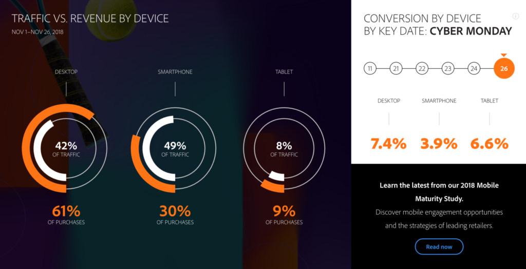
Last year, Black Friday’s sales turnout beat expectations by more than 10 percent. However, while many attempted to manage an anticipated mobile surge, conversion rates on the “favorite” shopping device came in dead last during Cyber Week. In the end, over $6.2 billion was spent online from Thanksgiving to the end of Cyber Monday. Mobile orders only accounted for 45% of sales. When you consider that mobile’s share of traffic was 62%, that’s a pretty weak conversion rate.
“In a world where responsive design is trying to give [customers] all the same functionality we have on desktop in mobile, there may be a divergence here where we have to start thinking about different mobile-first customer experiences.”
– Adam Morris, CEO, Redstage
Merchants and B2B companies who don’t start thinking with a “mobile-first customer experience” mentality will be left behind. Of course, it’s ideal to know and understand the buying habits of each customer, but tricky to do without the right technology. Thankfully, free data-driven A/B testing provided by the Mobile Optimization Initiative can help you overcome these barriers. Your customers aren’t going to wait for better mobile experiences, so why should you? Customers want to “click and go.” Lucky for you, implementing optimization is not only easy but the best option for B2B companies and retailers. B2B companies have a more complicated sales funnel that tends to increase aggravation and cart abandoment by 26%. With the Mobile Optimization Initiative, merchants can increase completed purchases dramatically by improving customers’ mobile experience with simple tweaks. Here’s how it works.
The Mobile Optimization Initiative is the ultimate holiday tool!
Last year, we published several articles about mobile optimization to help merchants close the “mobile revenue gap” by optimizing checkout experiences. With some of the tests we’ve run, retailers can cut mobile cart abandonment in half or more on certain devices.
“Optimizing your customer experience thorough data-driven optimization allows you to discover small tweaks that ensure you’re capturing as many sales as possible from the growing pool of mobile buyers.“
– Benjamin Shapiro, Solutions Engineer, Redstage
Those who join the MOI program with Redstage will receive a free checkout funnel assessment, custom test design, experiment implementation, and professional services during the active program. The goal of our global initiative is to help merchants get more revenue from mobile. In turn for the free services, we gather anonymized data about customer habits to create a knowledge-base for best practices in mobile. Learn more about our community proven experiments and sign up here. As the results show, it’s well worth it.
“With the current data collection and analysis tools available, we no longer have to speculate on where to put efforts to improve your site. The data is the guide in both where to focus your efforts, and where to expand after experimenting. Smart A/B testing based on data-driven analysis gives you insights that lead to successful, simple changes that can have a big impact on increasing your revenue per visitor. One recent participant – A lawn mower tire store – saw lifts of 24.9% and 7% RPV on desktop and mobile respectively through a‘sticky cart’ test.“
–Benjamin Shapiro, Solutions Engineer, Redstage
How Soon Should You Start?
The sooner you begin, the better. Participants start gathering testing data immediately, and all it takes is adding a simple tracking tag to your site (less than a minute). If you’re looking for a last-minute boost for your holiday marketing, this is it, and it packs a punch. Our latest test yielded a 25% increase in revenue per visitor.
The Mobile Optimization Initiative puts you ahead of the competition, because the experiments are proven, having been tested over millions of transactions across hundreds of merchant sites.As of December of 2018, experiments from 120 merchant sites generated a collective $22 million in revenue, averaging a 9.28% increase in RPV (extra revenue they would’ve missed without MOI testing). Today, we leverage the data from more than 200 participating merchants to ensure your tests are optimized for success. From this, we’ve created more than 130 standardized experiments to test, so now’s the time to join!
“We were struggling with mobile conversions and the MOI program helped us with the insights and adjustments we needed. This data-driven, forward-thinking program is certainly worth a try.”
– Digital Marketing Coordinator @ Lawnmower Tire Store
Final Thoughts:
Ignoring the trends means you’re missing out on your share of over $500 billion in online sales. With 95% of mobile devices being used to look up local information to visit businesses, it’s your business they should be checking out (pun intended). By this time next year, we expect the number of participants in the MOI to double again, which means it may be too late to get a leg-up on your competitors. Since the experiments work best during high-traffic periods, there’s no better time to test! And don’t worry, the tests automatically notify you if they’re not giving you positive results.
If you’re still not convinced, or don’t know where to start, check out the latest results, case studies, and strategies in our new Holiday Mobile Optimization Ebook here! Good luck this holiday season! Want to learn more about the initiative but before you sign up? Contact us here for a free consultation with our testing experts.

by Don Pingaro | Nov 28, 2018 | Commerce Strategy
At this very moment, retail executives around the US are likely screaming about their Black Friday and Cyber Monday sales performance. For some, these sounds resemble a triumphant war chant, for others, these are the shrill cries of defeat. The reason? Mobile-first adoption.
No matter where you stand, this data changes the eCommerce landscape. Here are the latest stats and key trends from the long-weekend of holiday sales events. We will update this article as soon as new data is released, so make sure you subscribe to be the first to know!
Thanksgiving Takes an Extra Helping
On Thanksgiving day, as of 7:00am Pacific Time, U.S. consumers spent $406 million. By 2pm, Adobe announced that this number skyrocketed to a whopping $1.75 billion, representing a 23% increase over sales in the same time period in 2017. By the end of the day, Americans beat out last year’s sales for the day by a shocking 28%, resulting in a shocking 3.7 billion dollar Thanksgiving. Adobe initially projected a $3.1B bottom line for the holiday.
Mobile Wins Big
Here’s a quick breakdown of the major events in bite-size chunks:
Thanksgiving Day
Black Friday
$2.1 billion or 33.5% of sales came from smartphones this Black Friday. Another 10% of sales, or roughly $627 million, came from tablet users. All in all, the day yielded an impressive $6.2 billion, a 23.6% increase over 2018.
Cyber Monday Breaks The Internet
Here’s the big one. Cyber Monday sales shattered all previous records for online sales… in U.S. history.
“Cyber Monday [topped] $7.9 billion by the end of the day, making it the largest online shopping day of all time in the U.S. This represents a 19.7 percent increase year-over-year (YoY) as of 7:00 p.m. ET. In comparison, Thanksgiving Day and Black Friday brought in $3.7 billion (28 percent growth YoY) and $6.2 billion (23.6 percent growth YoY) in revenue, respectively.”
BusinessWireHere’s the share of devices (as of ~1:30pm ET November 27, 2018):
 See more live stats at ExploreAdobe.com
7 Days of Spectacular Sales
Additionally, Adobe’s latest report notes that this November has seen 7 days where total sales broke the $2 billion mark (as of Nov. 28, 2018)… Thanks in no small part to the mobile sales spikes.
Omnichannel Adoption Drives Sales
The trend of “buy online, pick-up in-store (BOPIS)” continued, with the trend growing 50% during this past weekend over 2018. According to Adobe, this spells dollar signs for omnichannel merchants: “As the online and offline retail experience continues to blend, retailers with physical stores drove 28 percent higher conversions online.” While this trend helped retailers increase their share of online earnings, in-store sales lagged far behind.
It’s time to join the mobile-first movement. As Adam Morris, Redstage CEO notes, “Cusotmers are no longer expecting an in-store Black Friday and Cyber Monday, but instead, an omnichannel experience.” While many retailers successfully ramped up their omnichannel strategies for this holiday, the data shows this trend is here to stay, and more work is needed.
If you want to reduce mobile checkout friction before the holidays are over, contact us asap! To see the results we’ve achieved with our recently launched Magento Community Initiative, find the latest data here.
Final Thoughts
These extravagant stats spell success for an industry racing to close the mcommerce gap. It’s seems the industry is all-aboard the mobile-first customer experience wave. As Internet Retailing points out, retailers may have finally reached ‘always-on‘ mobile consumers. Now it looks like the key areas for improvement are streamlining mobile checkouts, and optimizing omnichannel experiences.
Update Nov. 28, 2018
Black Friday + Cyber Monday Stats You Need To Know
Here’s a breakdown of YOY holiday sales by device and region based on data collected by our partners at Nosto!
-
- United States
Desktop: 39% (2017) / 34% (2018)
Mobile: 56% (2017) / 61% (2018)
Tablet: 5% (2017) / 3% (2018)
-
- United Kingdom
Desktop: 47% (2017) / 40% (2018)
Mobile: 42% (2017) / 48% (2018)
Tablet: 11% (2017) / 12% (2018)
-
- Northern Europe
Desktop: 39% (2017) / 37% (2018)
Mobile: 51% (2017) / 57% (2018)
Tablet: 10% (2017) 6% (2018)
-
-
- France
Desktop: 69% (2017) / 67% (2018)
Mobile: 19% (2017) / 22% (2018)
Tablet: 12% (2017) / 11% (2018)
- DACH
Desktop: 40% (2017) / 53% (2018)
Mobile: 42% (2017) / 39% (2018)
Tablet: 8% (2017) / 8% (2018)
Update Nov. 29, 2018
PayPal Mobile Payments Get A $2B Holiday Boost
-
- For the first time in PayPal history, mobile payment volume topped $1 billion, and did so on both Black Friday (November 23) and Cyber Monday (November 26). – PAYMNTS
-
- Adobe reports U.S. shopping carts averaged $138.00 during Cyber Monday, a 6% bump over last year.
-
- 49% of Black Friday traffic came from smartphones, driving 30% of online sales.
- “In the [PYMNTS] Checkout Conversion Index report, the 30 merchants with the fastest, most streamlined online checkouts ranked well. Conversely, the 30 merchants with the lowest scores offer a widely inconsistent checkout experience…”
Update Nov. 30, 2018
Cyberweek 2018 Trends Report
Our partners at BigCommerce identified a few additional trends in their Cyberweek 2018 Trends Report. Key findings include:
-
-
- While online stores continue to have the highest AOV for any sales channel, Facebook took second place, accounting for “70% of total GMV” for Fashion and Jewelry brands using the channel. Home and Garden brands selling on Facebook came in at 16% GMV.
- “The Fashion & Jewelry and Toys & Games verticals saw the highest GMV increases over 2017.

by Don Pingaro | Dec 27, 2017 | UX/UI Design
Last week, Google announced the launch of mobile-first search indexing for a “handful” of websites. Although Google’s search engine won’t be giving priority to responsive sites until later in 2018, it’s time to prepare. Bookmark this page and subscribe for all new developments as Mobile-First SEO goes mainstream. For now, let’s dive into everything you need to know to get ready.
>>Skip to Recent Updates
Mobile-First SEO
It’s been said countless times, but mobile traffic matters. Every time mobile customers struggle to navigate your site, you’re losing money and market share. As recent studies estimate, over 55% of web traffic comes from mobile devices. Google affirms these numbers, saying “most people” are now searching from mobile.
Get Responsive, Fast
If your site isn’t responsive yet, it’s time to hop on the train. If the $2 billion racked up from mobile in Black Friday sales was any indication (especially considering the total for Black Friday online sales was $5B), your company better have a responsive site in development. The best way to ensure your SEO stays intact when the changeover occurs is to have your site completely mobile-ready in every way possible.
Mobile-First Ranking Difference
As Search Engine Land reports, “With desktop sites, Google said that content hidden in tabs, accordions, expandable boxes and other methods would not be weighted as high. But when it comes to mobile, Google’s Gary Illyes said content like this will be given full weight if done for user experience purposes. The idea is that expandable content makes sense on mobile and not so much on desktop.” While the leadership at Google expect mobile-first ranking to only have ‘minimal’ impact on changing current search results, sites who haven’t adapted properly may fall far from the first page.
‘Advantageous’ Changes
As Tech Crunch reports, Google has publicly announced that, “Pages that already take advantage of responsive web design and implement dynamic serving don’t usually have to do anything to be ready.” However, while some sites have a mobile version, mobile sites occasionally hide content that’s found on the desktop version (think long product descriptions). If this is the case for your site, you’ll need to do some restructuring for a seamless transition. Your site doesn’t need to be completely identical across platforms, “but it should contain all the information users need to know about your business,” according to SEMrush. Providing as much content as possible, while keeping it fast and responsive seems to be the ultimate happy-medium.
How to Prep
So far, we already know that Accelerated Mobile Pages (AMP) will give your site an edge for ranking higher in mobile SERPs. Experts agree that while making big changes to SEO optimized mobile pages may be a daunting task (especially for eCommerce sites), they suggest implementing AMP to prep your Mobile-First SEO.
What We Don’t Know

How will Google index your “hamburger” navigation when it crawls your site? Will H1 and H2 tags be indexed the same on mobile and desktop so site UX can stay in-tact? Do certain photo-resizing methods give sites an upper-hand? How do mobile ads play into the new search rankings?
Flipping The Switch
It’s still unclear how exactly Google will initiate the switch-over. At the SMX West conference last spring, Google’s Garry Illyes said the new index will not come until search results are “quality neutral.” In a Google Hangout, Webmaster Trends Analyst John Mueller recently said Google might choose to switch-over batch-by-batch while others speculate there may be a day when Google decides to flip the switch for everyone. For now, however, it seems Google’s goal is to keep search results the as close as possible to how they appear today.
UPDATES
Jan. 19, 2018 — PracticaleCommerce confirms Google’s plans to make the speed of mobile webpages a ranking factor. Since “Shoppers Expect Speed,” this will be especially important for eCommerce sites. The “Speed Update” is slated for July 2018.
See some awesome stats on site speed & mobile user behavior here.
Feb. 22, 2018 — SERoundtable reported today that Google plans to phase-in the next batch of sites to the mobile first index in the next few weeks! Google’s Gary Illys made the announcement yesterday at PubCon. Again, the company said they will hold true to their promise not to move your site until you are ready… But you are getting ready, right? Let us know if you need any help getting your fully responsive store up and running!
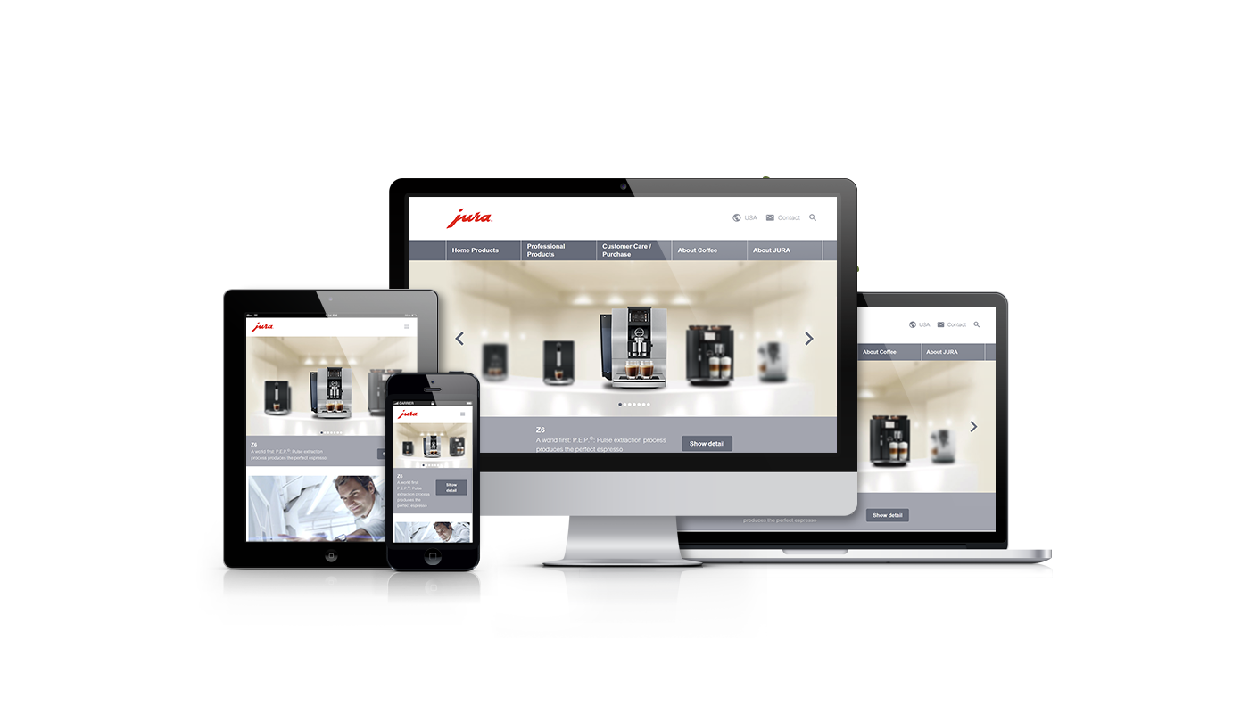
Go Mobile Now
Redstage specializes in responsive eCommerce site development. Want to learn more about how we can help make your Magento site mobile-friendly?
Shoot us a message today and let’s make your dreams a reality. View our responsive design work
here.


Recent Comments