
by Agbi B. | Feb 24, 2014 | Uncategorized
We recently did a webinar titled “Responsive Design: What it is and why it’s so important for 2014”. If you missed it, the entire webinar is live (free of charge) on MagentoCommerce.com. In the presentation, CEO Adam Morris demystifies responsive design and discusses why it is so important for 2014. Check it out below!
https://www.magentocommerce.com/media/webinars/redstage-responsive-design/
Originally Aired: February 19, 2014
Join Adam Morris, Co-Founder and CEO of Redstage, as he discusses what Responsive Design is and why it is so important for this year and going forward. Adam and his team at Redstage are seasoned experts in eCommerce design, development and marketing. Some of the main takeaways from the presentation are:
- Current Mobile and Tablet usage statistics
- What Responsive Design is and how it works
- The benefits of Responsive Design

by Agbi B. | Feb 19, 2014 | System Integrations

Every month we feature a new partner on this blog. This month we’re introducing Springbot and their eCommerce marketing robotics platform.
Springbot is a Magento Gold partner that delivers an eCommerce marketing platform to small & medium merchants. Their SaaS offering integrates and makes simple the data, content and multi-channel marketing tools (social, online, mobile, email) merchants need to drive more traffic, conversions and overall revenue. Springbot helps eCommerce SMBs grow their revenue by taking smarter, data-driven marketing actions.
Springbot is passionate about helping small and medium eCommerce merchants grow their businesses. We deliver an eCommerce marketing platform to help merchants tackle the “eCommerce challenge” – combining the power of marketing automation and marketing analytics to deliver their Marketing Robotics™ service.
Springbot will be attending the Magento Imagine conference at the Hard Rock Hotel in Las Vegas as a Silver Sponsor. The will also host a lunch event (date to be confirmed) for merchants, partners and prospects.
Important Results
Country Club Prep –
- Increased site traffic by automating abandoned cart retargeting
- Launched targeted email based on customer demographics
- Used trackable links to better analyze which products generated more traffic and dollars
Click here for the full Country Club Prep case study
First Aid Safety –
- ROI of 112%
- Over 300 product content recommendations taken
- Increased online sales by 3X in 6 months
Click here for the full First Aid Safety case study
Springbot has recently launched their Partner Program, providing quality benefits and services that expand and enhance the functionality of their marketing automation and marketing analytics platform. For more information check out their partner page: https://www.springbot.com/springbot-partner-program/
In addition, Springbot has just launched a new ‘Holiday Marketing Assessment’ for new customers who sign up for a free trial. The assessment is designed to help stores move into 2014 with a better understanding of how their store, demographic and performance data performed from 11/1-12/31 from 2012 to 2013. Click here for more information on the Holiday Marketing Assessment.
For more information and to request a demo, email: sales@springbot.com

by Agbi B. | Feb 10, 2014 | UX/UI Design
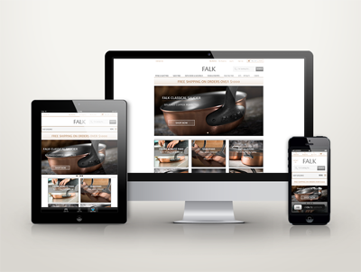 We previously posted about what responsive design is and how to get started on a responsive design for your website. If you haven’t seen that post, you can read that here: Responsive Design: What is it and what do you need to know
This post will go into some detail about why responsive design is so important, specifically for Mobile and Tablet Devices. Originally, designers and developers only had one main challenge to deal with – maintaining the same look and feel of their website across multiple desktop computer browsers. As more and more mobile smartphones and tablets are released, things have started to get a little more complicated.
So, why Responsive Design?
Cost of Ownership You may be asking yourself: “Why not just build a Mobile site and a tablet site?” Well, you could do that, but then you’re stuck with three different sites that you need to update as your site evolves. While there might be a slightly higher cost to implement a responsive theme, you’ll find that the cost of ownership is actually significantly lower when you factor in the cost of updating and maintaining one responsive site versus multiple sites for desktop/mobile/tablet.
User Experience is Important Content may be king, but user experience is becoming a much larger part of the picture. A good user experience enables visitors to consume content on any website through the device of their preference at any time. As such, responsive web design is necessary to provide the optimal user experience for all site visitors regardless of what kind of device they access your site with.
Available to Anyone, Any Time These days, people are constantly moving and on the go. Responsive design lets users access and view your site easily regardless of where they are and what kind of device they have. Early morning commuters can browse from their mobile devices and tablets, and then access the site from a desktop computer or laptop when they get to work or back home.
When Google Talks, We Listen Google has about a 67% market share on search, so when they want something you do it. Google says that responsive design is the recommended configuration for mobile devices. Additionally, google refers to responsive design as the industry best practice (https://developers.google.com/webmasters/smartphone-sites/). The reason for this is because websites that use responsive design have one URL and the same HTML making it easier for Google to crawl and index the website.
Mobile Browsing Statistics It’s easy to support implementing a responsive strategy from a cost, design and usability, or marketing standpoint alone, but beyond that the statistics for mobile and tablet website browsing are compelling enough. Statistics show that 91% of all people on Earth have a mobile phone and 56% of people have smartphones. Out of all mobile phone users, 50% say that they use their mobile device as their primary internet source. That’s over 3 Billion (yes, Billion with a ‘B’) people browsing the web on their mobile phones. Moreover, people are turning to the mobile web at much higher rates than they did with desktops in the 90’s and early 2000’s with adoption rates 8 times higher. A recent survey has shown that 80% of consumers plan to conduct mobile commerce during 2014 with over half of the respondents (57%) saying they would not recommend a business with a poorly designed mobile site.
The graphic below shows just how much people are using tablets to consume data on the web and the expectations for mobile payment growth over the next few years.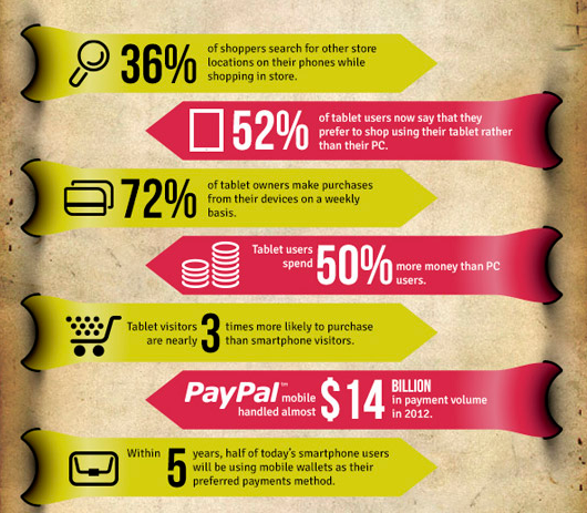
Infographic created by www.supermonitoring.com
As the number of people with web-enabled tablets and mobile devices increases, so does your customer base. If you fail to grasp the importance of this and don’t implement your Responsive strategy right away, you’re putting yourself at a big disadvantage.
Want to talk to someone about implementing a responsive strategy for your site? Call Redstage today!


Recent Comments