Responsive Design – Becoming Unassailable
“The art of war teaches us to rely not on the likelihood of the enemy’s not coming, but on our own readiness to receive him; not on the chance of his not attacking, but rather on the fact that we have made our position unassailable.” –Sun Tzu
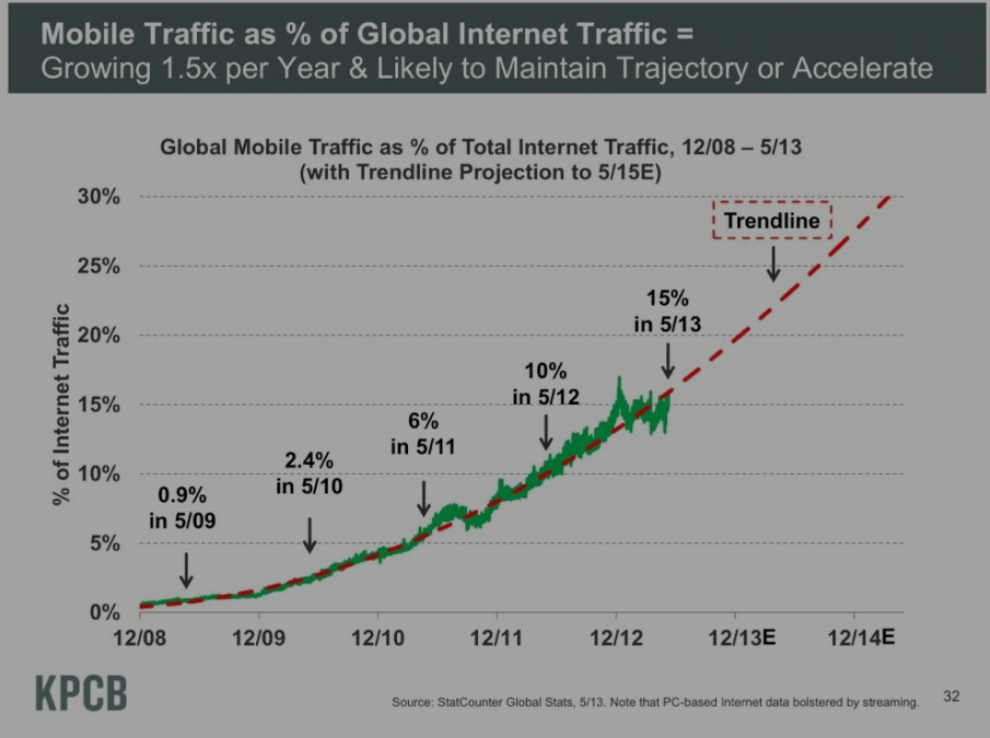
The battlefield of the Consumer Market has changed. Consumers are no longer accessing your website from a single type of device. Reports show that mobile based traffic will be growing to 30% of overall traffic in the very near future.

The reality is that this chart is unfairly skewed toward the PC since streaming traffic is currently less prevalent on mobile devices.
To compound the issues that online retailers are facing, new sizes and resolutions of mobile devices are released monthly. Simply optimizing for the iPhone Retina or iPad is no longer an option.
In this fast growing, diversified mobile world, how can you rise above your enemy? How do you make your position—as Sun Tzu put it—“unassailable?”
RESPONSIVE DESIGN or Responsive Web Design is the art of creating a site that adapts to different sizes, devices, and input types—automatically. It is a non-app based; non-separate mobile site web design strategy. To get slightly more technical, it is web design that uses fluid grids (modifying code that defines grid dimensions in relative terms to maintain the proportions of your web design across differently sized browsers), flexible images (browser code that that flexibly scales images), and media queries (which basically “instructs” browsers to re-render layout instantly as the viewport/device screen changes size; without the issues of device compatibility).
But why choose Responsive Design over creating apps and mobile versions of your website? We’ve got some very compelling reasons for you…
Responsive Design Consolidates Marketing Strategies.
If you opt to create a mobile version of your site (an “m.site” where your main site redirects to when accessed on a mobile device) you lose or sacrifice the quality of this analytics data that gives you insight into your customer base and target market. You also run the risk of getting flagged for duplicate content, which although avoidable takes more effort and resources to keep in check. Responsive design keeps your analytics data intact by utilizing the same site regardless of the device. The source pool of this analytics data is even broadened, thus providing you more intimate insight into your customer’s needs and preferences.
Furthermore, you get SEO benefits as all backlinks link to one website. m.sites often end up stealing valuable SEO juice and can even outrank your main site on a desktop search for certain key terms.
Responsive design also dramatically decreases bounce rate (consumers losing interest in your site due to aesthetic and/or functionality/usability issues) because the content presentation, accessibility, and whatever marketing strategy you have applied remains intact and optimized for the consumer’s experience.
Responsive Design Creates Conducive eCommerce Environment.
PCs are meant to be used with a mouse and keyboard interface. Tablets often have users interacting with multiple fingers and enjoy swiping to navigate. And smartphone users are happy if they can navigate with just their thumbs. Responsive design can handle all of these by automatically adjusting the user experience as the size hits certain trigger points, or “viewports”.
Simply put, responsive design makes buying easy and seamless. It further strengthens consumer empowerment by automatically customizing the content of your website thus allowing the customer to enjoy the best buying experience from their favorite device.
Allowing your customer to make his purchase when and how he wants to communicates that you are valuing his time and preferences. Responsive design refocuses the content and content display of your website to cater to the customer’s device of choice, making the layout of your website adaptive—automatically adjusting at viewport/screen “breakpoints.” Meaning your customer’s experience of your website is optimized across ALL devices. This beats “small screen strategy” (which runs the risk of your website content being next to inaccessible because it just shrinks the website to fit a particular screen) and “mobile app strategy” (which runs the risk of sacrificing content and functionality that a customer may need to engage your product).
Responsive design is great because it marries both strategies into a concise, cohesive, forward-thinking approach. A customer doesn’t have to tediously “pinch and zoom” your website on his mobile browser nor does he have to lose valuable minutes going to the app store, looking for your app, downloading it, installing it and only then getting to use it—that doesn’t even include the time it takes for her to navigate through your product line, make his selection, and process her purchase.
Applying responsive design to your website lets the customer browse your site optimized for his device; lets him make his purchase unimpeded and uninterrupted—as easily and quickly as he would on his desktop or laptop.


Recent Comments