Over the years, we’ve made a lot of changes and improvements to our internal design process. Being able to work closely with our development team has helped our designers put together high quality design mockups that are ready and easy to work with. However, not everyone has the luxury of working closely with a developer to make sure the designs they are creating are organized and ready for a developer to implement.
The tips below should help you and your design team put together a stunning design that is ready to go to development.
Be As Detailed As Possible
Don’t assume that developers will always know what you intended for a particular page or design element. That said, a designer doesn’t need to create a design for every possible page on a site (and that can get quite time-consuming) As a guideline, the requested pages are a minimum requirement to style your site. For an eCommerce site, usually we ask clients for designs for:
- Home Page
- Category/Search Results
- Product Page
- Shopping Cart
- Checkout
For blogs/content sites, we ask for:
- Home Page
- Category/Search Results
- Single Post Page
Plus, include designs for any other custom pages that contain any functionality that isn’t inherent in the platform. Developers need to know how they will look and how users will interact with them. For example, for eCommerce sites, a category landing page, a timed sale or daily-deal product, a video gallery, or a bulk order form for wholesale buyers are usually custom features. For blogs, custom pages might include a custom contact page with a map, or a restaurant booking system.
For each of these, however, be aware of the functionality of your platform. In Magento, for example, a typical Checkout page is a multi-step process, whereas one step checkout has a completely different layout and requires an extension and usually some further customization (see example below). Be aware of budget concerns when implementing elements like this.
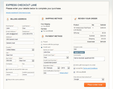
One Step Checkout Example
For responsive design, we include all of the above listed design comps for the three major viewports:
So, for eCommerce website designs, multiply this by the five pages above and that’s 15 page designs.
Other Pages
Do you have a custom 404 Error page? Want to style your user account page a certain way? These types of pages will need a separate design if it doesn’t follow what you’ve already provided your developers. Going responsive? Make sure you design for each viewport above!
Show Different States
What does it look like when you hover over a link? Does your navigation bar have a different state when hovered over? Does mousing over an image have any functionality? If you’ve answered yes to any of these questions, then you need to provide your developers with another comp of this state. You can also use different layers/groups to display these custom states which is convenient so your developer doesn’t need to work with multiple files for the same viewport. Just be sure to communicate that these layers/groups are there and make sure your developer understands what you are trying to accomplish.
How do downloadable products look versus simple, or configurable products? If there is a different experience on these pages, be sure to design it. Don’t leave it up to your developer to decide where any extra elements go – you’ll end up unhappy and have to pay extra for a change.
Other Considerations
Choose the right Resolution – the majority of monitors today display at a resolution of 72DPI. Be sure that your designs are in this resolution because that is what your developer will probably be working with and what most people visiting your site will see.
Color Mode – much like resolution, you want to make sure to use a color mode that is common across the majority of devices that will be viewing your site. For color mode, we recommend using RGB color mode. If you work on a lot of print media, you probably do most of your designs in CMYK color mode, so be sure to change this when you start working on your design comps.
Responsive Design – if you are designing a responsive site, start with mobile. Since it is the most restricting viewport due to limited space, it is important to make a design that is clean and works in a mobile experience. Then work your way up to tablet and desktop designs. When you are working with more space, it is easy to increase the size of elements or add extra elements that are extraneous in a mobile experience.
Organize your Layers and Folders – keep your designs neat and organized to make it easier for your developer to work with them. Label things so they make sense and group layers together into folders so everything is easy to find.
Include All Fonts – if you’re working with non-standard fonts, be sure to include them in your design files so the output from development is exactly what you intended. If you can’t provide the developer with the appropriate font for their machine, provide them with a list of the fonts you used so they can get them before working on your site.
Delete Extraneous Layers – we all know that designs evolve and change as you work on them. Sometimes you’ll create a layer or an element that you don’t want in your final design and simply hide it and forget about it. When you’re done with your design, go through and clean up any extra layers that aren’t being used. It’ll make it much easier for your developer to work with and avoid any confusion.
Want some help with your next project? Call Redstage today!